One mark, two scripts, and the numbers behind them.
This is the reference for anyone drawing, printing or building anything that carries the Mithaq name. Every colour pair below shows its measured contrast, every mark states the size it is for, and every file here is generated from a single geometry file so there is exactly one drawing of the arch.



Four rules that decide the rest.
A board paper outlives a trend.
Minutes signed this year are read in a dispute five years from now. Choose the typographic and colour decisions that will still be legible then, not the ones that look current this quarter.
Arabic is not a translation layer.
Both scripts are set in the same family, at matched optical size, with the same hierarchy. An Arabic page is not an English page with the text swapped; it is mirrored, and the mark moves with it.
Publish the measurement.
Contrast, isolation, size. A colour pair ships with its ratio next to it. If a number is not on this page, the pairing has not been checked and must not be used.
Draw once, cut three ways.
The mark is one geometry with three cuts chosen by rendered size. Nobody redraws it by eye for a new surface, and nobody scales the detail cut down into a favicon.
A doorway that reads as an M.
The mark is a pointed arch, the doorway of the majlis, whose counter drops into a chevron so the negative space carries the M of Mithaq. It is drawn once. Which cut you use is decided by the size it will render at, never by taste.
Thicker stems, no centre slit, wider counter, and the same apex angle to within 7 %. The cut for a favicon, a 22 px nav mark, a table avatar.
SVGThe drawn contour, and the mark of record. Every platform icon carries this cut whatever the tile size, because a tile is a silhouette job.
SVGThe contour with the geometric tympanum. Covers, hero cards, large print. Never on an icon, and never below 96 px: the lattice turns to grey mud.
SVGConstruction
The micro cut is built on a 100 by 131 grid, the ink ratio of the drawn contour. The stem is 16 units and is the unit for everything else: clear space, the gap in a lockup, the minimum rule weight beside the mark.
Clear space and minimum size
Keep one stem width, 16 % of the mark's width, clear on every side. Nothing crosses it: no rule, no photograph edge, no text.
- Screen minimum 16 px tall, micro cut.
- Print minimum 6 mm tall, standard cut.
- Detail cut never below 96 px or 24 mm.
What breaks it
Do not put the mark in a square box. It is 100 by 131; a square either stretches it or shrinks it by a quarter.
Do not add a rounded tile to an app icon. The platform rounds it, and a second radius reads as a sticker.
Do not put the green mark on brass. The pair measures 5.21:1 and the arch loses its edge.
Do not use the detail cut small. Below 96 px the tympanum is noise, not pattern.
Six files. No seventh.
The wordmarks are outlines, not live text, so they render the same in a browser, in a PDF and on a machine that has never heard of the brand font. If you need a lockup that is not here, ask for it to be generated. Do not set the name in a font and call it a logo.
Default. Nav bars, letterheads, email signatures.
SVG
Arabic surfaces. Mark on the right so the eye starts where the reading starts.
SVG
On brand-900 or a photograph dark enough to hold it.
SVG
Arabic on dark.
SVG
Square-ish. Organization schema, profile pictures, covers.
SVG
The same, on dark.
SVGEvery pair ships with its ratio.
Each token states the role it plays, and the role decides which number matters. A text token is graded at 4.5:1 on the grounds it is written on. A graphic token, a rule or a mark or an icon, is graded at 3:1. A surface is not graded at all; it shows the contrast that text gets standing on it. Nothing here is graded against a ground it is never used on.
Green
#ecf5f1 Tinted panels, selected rows
- ink on it
- 15.30:1 AAA
- paper on it
- 1.06:1 fail
#d2e6dc Hairlines on green, chart fills
- on night
- 13.33:1 AAA
#6fa692 Disabled green, chart mid
- on paper
- 2.67:1 fail
- on night
- 6.25:1 AAA
#1e6b55 Interactive green, focus ring
- on paper
- 6.12:1 AA
#155340 Primary. Buttons, icon ground
- on paper
- 8.59:1 AAA
#0e3d2f Headings, the mark, the doorway
- on paper
- 11.65:1 AAA
#071e17 Dark sections, the footer
- ink on it
- 1.02:1 fail
- paper on it
- 16.67:1 AAA
Brass
#e2cda3 Headings on dark green
- on night
- 11.18:1 AAA
#d4b88a The mark at icon scale
- on night
- 9.13:1 AAA
#c5a572 Rules, marks, non-text brass
- on night
- 7.46:1 AAA
#a88851 Display headlines on paper, borders
- on paper
- 3.19:1 AA
- on night
- 5.22:1 AAA
#876936 The only brass allowed to carry small text
- on paper
- 4.90:1 AA
Neutral
#1b1d18 Body text
- on paper
- 16.28:1 AAA
#3e4238 Secondary text
- on paper
- 9.86:1 AAA
#6d7165 Captions, meta
- on paper
- 4.79:1 AA
#e6e3d9 Hairlines and borders
- ink on it
- 13.24:1 AAA
- paper on it
- 1.23:1 fail
#d0ccbe Stronger borders, inputs
- ink on it
- 10.57:1 AAA
- paper on it
- 1.54:1 fail
#9b9d90 Disabled text. Never a live label: 2.64:1
- on paper
- 2.64:1 fail
#faf8f2 Table stripes, card wells
- ink on it
- 16.00:1 AAA
- paper on it
- 1.02:1 fail
#ffffff Cards on paper
- ink on it
- 17.00:1 AAA
- paper on it
- 1.04:1 fail
#fbfaf7 Page ground
- ink on it
- 16.28:1 AAA
- paper on it
- 1.00:1 fail
#f4f1ea Alternating sections
- ink on it
- 15.07:1 AAA
- paper on it
- 1.08:1 fail
The two brasses, and why there are two
The brass of record is accent-500. On brand green at icon scale it manages only 3.84:1, so the app icon and the favicon use accent-400 at 4.70:1. That is an optical correction for size, not a second brand colour, and it applies nowhere else. For brass carrying small text the only allowed value is accent-700 at 4.90:1 on paper.
Separately from readability: brand-600 and brand-700 are 10.1 apart in CIE76, which is why the doorway inside the icon reads as depth at 180 px and disappears at 32 px. That is the intended behaviour, and it is a distance, not a contrast ratio.
One family, both scripts.
Dialogue ME carries Latin and Arabic in one family, so a bilingual page does not change voice when it changes script. JetBrains Mono sets eyebrows, tokens and anything that is a value rather than a sentence. There is no third face.
The board approved the amended financial bylaw, with one abstention recorded.
اعتمد المجلس اللائحة المالية المعدّلة، مع تسجيل امتناع واحد عن التصويت.
Arabic is set one step larger than the Latin at the same level, because the same point size reads smaller. Never justify Arabic with letter spacing, and never stretch a word with kashida to fill a line.
Chosen at 1024, used at 32.
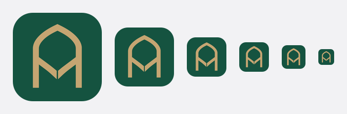
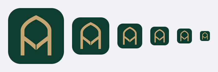
An app icon is picked on a large canvas and then lived with at the size of a fingernail, on a wallpaper nobody controls. These are the gates every Mithaq tile passes before it ships, and the proof sheets they passed on.
| Gate | Target | Measured |
|---|---|---|
| Ground isolation | dE76 ≥ 35 against white and against black | 40.1 |
| Mark contrast | ≥ 3:1, the WCAG floor for a graphic | 4.70:1 |
| Full bleed | All four corners equal the ground, no radius of our own | checked per file |
| No alpha | App Store rejects an icon with an alpha channel | checked per file |
| Small-size proof | Rendered at 180, 120, 80, 60, 48 and 32 px and looked at | sheet below |
App icon, light and dark
Favicon
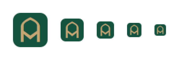
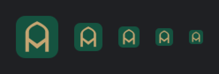






The pieces, as they actually render.
These are live elements using the shipped stylesheet, not pictures of them. If one looks wrong here it is wrong in the product.
Meetings before, during and after, with minutes, decisions, motions, polls and signing records in one audit trail.
sm 6pxbase 10pxlg 14pxxl 20pxsmbaselgWrite like the secretary, not the vendor.
Do
- Short sentences. One idea each.
- The same word for the same thing, every time.
- Numbers instead of adjectives. "Two deployment routes", not "flexible deployment".
- Say what is not built yet, in the same tone as what is.
- فصحى for Arabic. Never dialect, never a translated English sentence.
Do not
- Em dashes. Commas, colons, periods, parentheses.
- Seamless, robust, comprehensive, cutting-edge, best-in-class, leverage, synergy.
- Customer logos we have not earned.
- Present tense for something that is on the roadmap.
- Exclamation marks. A board paper has never needed one.
Everything on this page, in one list.
Every file below is written by scripts/build-brand-assets.mjs from
scripts/brand/geometry.mjs, and the build fails if any one of them was
not rewritten on the run. That assertion exists because the detail cut carried a
"generated, do not hand-edit" label for months while the script never touched it:
it was a hand-made export whose artboard clipped its own artwork. The one file here
the generator does not own is brand.css, which is hand-maintained and
gated instead: the build refuses a stylesheet that declares any custom property
twice in one block.
brand.cssmithaq-mark-micro.svgmithaq-mark.svgmithaq-reversed.svgmithaq-logo-mark.svgmithaq-logo-mark-reversed.svgmithaq-logo-horizontal.svgmithaq-logo-horizontal-ar.svgmithaq-logo-horizontal-reversed.svgmithaq-logo-horizontal-ar-reversed.svgmithaq-logo-stacked.svgmithaq-logo-stacked-reversed.svgmithaq-wordtype.svgmithaq-wordtype-ar.svgfavicon.svgfavicon.icofavicon-16.pngfavicon-32.pngfavicon-48.pngapple-touch-icon.pngicon-192.pngicon-512.pngapp-icon-1024.pngapp-icon-1024-dark.pngapp-icon-1024-tinted.pngandroid-icon-foreground.pngandroid-icon-background.pngandroid-icon-monochrome.pngmithaq.webmanifest